The Rule Of Thirds: What Is It? How Do You Use It In Photography?
Composition, or what’s included in a photograph and where, is a big part of capturing creative photos. Photography composition can help make one photo of an object quite a bit different than another photo of the same thing. The rule of thirds is a guideline that helps photographers determine where to place that object.
What is the rule of thirds?
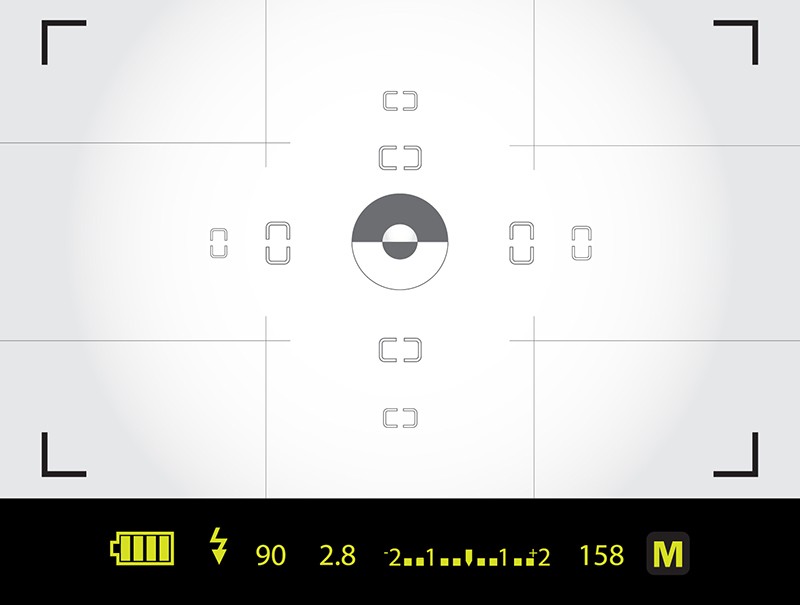
Imagine your image is divided into sections by a tic-tac-toe board like the grid here:

The rule of thirds simply suggests that you place your subject on one of the places that those lines intersect. So, instead of putting the subject where you’d place the Xs and Os in that game of tic-tac-toe, place the subject directly on the grid.
Also you can read : Mastering The Art of the Virtual Meeting
Learn Photography
Master the fundamentals of photography, from the basics to advanced techniques, and become a professional photographer.

Using the rule of thirds means that the subject isn’t centered in the image, which is a mistake new photographers make when they frame their shots. Instead, the main focal point is a bit off to one side.
Recommended for you: Free 4-week Photography course.
Why? Using the rule of thirds draws the viewer’s eye into the composition, instead of just glancing at the center. By placing the subject off center, you also embrace more blank space. The rule of thirds is also helpful for highlighting an interesting background. Off-centered subjects tend to convey more of a feeling of motion than centered ones.
 How Do You Use The Rule Of Thirds?
So, the rule of thirds suggests placing the subject off center. But which of those intersecting lines should you use? That of course depends on what you’re photographing, but there’s a few things to consider to help you make the best choice.
If the subject is small, use an intersection of the grid. If the subject is largeor long, try placing it along one entire line.

If the subject is looking in a certain direction, leave the empty space in the same direction that they’re looking towards. So, if you are taking a portrait and the subject is looking towards the left, place them on that grid line on the right.
If the subject is moving, leave the empty space in the direction that they are moving in. This gives the subject a sense of moving forward, and allows the viewer to see a little of where they’re headed.

One of the key landscape photography tips to consider when taking a photo is to place the horizon on one of those horizontal grid lines, instead of dead center in the photo. This allows you to highlight either more of the sky, or more of the land, whichever is more interesting.
If you can’t decide, like when the subject isn’t moving or looking in a certain direction, placing the subject towards the right is often favored. Why? Since we read left to right, it’s a natural way of drawing the viewer’s eye into the entire photo.
When to break the rule of thirds
Like any rule inside a creative application, the rule of thirds can (and sometimes should) be broken. But don’t just break the rules because you’re feeling rebellious. You should have a good reason for breaking the rules. Artistic rules are meant to be broken, not ignored. There’s a big difference between intentionally breaking the rule of thirds and simply ignoring it because you have no idea what it is. There are a number of different reasons to break the rule of thirds, but here’s a few good ones:
Centering a photo highlights symmetry and pattern in a way that the rule of thirds does not. The symmetry or pattern is more easily identifiable when the photo is centered.
Placing the subject in the center makes it appear more confrontational. If your goal is for the subject to look big and intimidating, a center placement might be more effective than using the rule of thirds.
When your photo tells a story, sometimes a centered or even extreme side placement conveys the story better than the rule of thirds.
When the entire scene is interesting, placing the subject up close to the edge or even in a corner is a good way to highlight that. This composition is one of the trickiest to do and do right, though.
The rule of thirds is the most well-known composition guideline. It helps draw the viewer’s eye into the image and places more emphasis on the subject. Ideally, the empty space that’s left should be in the direction the subject is looking or heading into. The rule of thirds doesn’t work 100 percent of the time though. Centered placements are best for showing symmetry, or making the subject appear more confrontational. Thanks to digital, it’s easy to experiment and try a few different compositions, so head out with your camera and experiment with placing the subject on a few different points, then try breaking the rules and seeing which photo you like the best.
Looking to sharpen your photography skills? Join our top-rated online photography course today!


