If you love designing and enjoy creating and designing amazing works of art, getting a job as a designer is a great opportunity to unleash your creative streak. It also pays well if you practice and perfect the art. However, once you begin designing, you’ll notice how institutions focus majorly on the right font and the right look for the design.
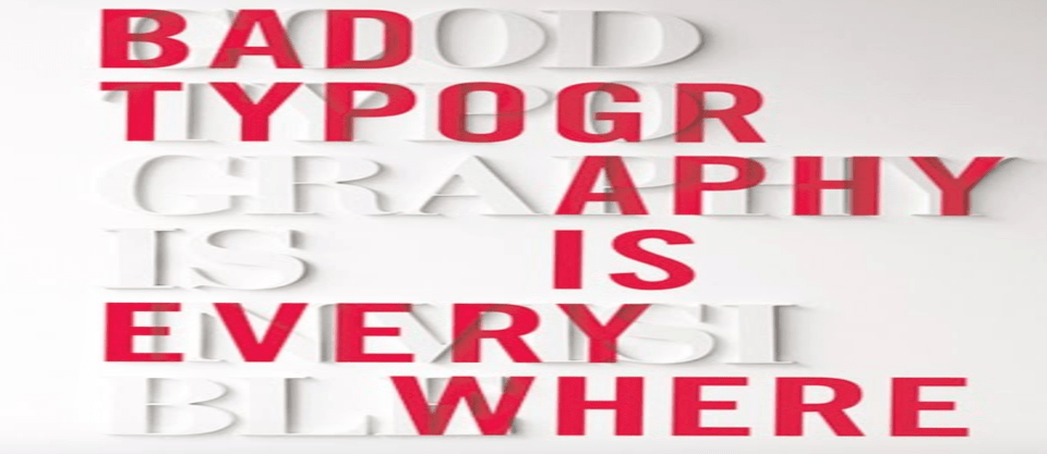
Good typography is extremely essential, and several experts consider it to be almost all of what makes a good design. Typography design can enhance a brand’s communication both visually and verbally, playing a pivotal role in website design, magazines, apps or any other medium.
Here are the basics of typography design that every budding graphic designer cannot miss out on:
What Is Typography?
Typography, in essence, is the balance and interplay of letterforms on the page; a verbal and visual equation that helps the reader understand the form and absorb the message effectively. Be it web typography or print, the art of typography establishes a visual hierarchy for a brand or design by adding a visual element to accentuate the readers understanding of a particular content.

The use of typography is not just to create visually appealing text; it leans more towards enabling a particular messaging or thought process effectively. While the study of typography design covers multiple aspects like layout, grid, colour scheme and so on, the fundamental concepts go a long way in enhancing a design.
Know How To Use A Style Guide
When starting out, the main factor is to understand how it fits into the style guide. A style guide is a document that helps the designer understand the requirements, and defines the typography, colour and layout to be used for creating a particular design. Style guides typically have Headline text, Sub-head text, Navigation text, Body Copy, Byline Text among others.
The style guide helps designers create outcomes that are in line with a company’s branding or can act as a reference point for creating visually appealing designs that don’t just look good but also suit the content.
Understand Typefaces
There are over a thousand different fonts, each with their own purpose. In the process of font design, typefaces play a critical role by helping designers choose the correct font family and kerning pairs to express an idea or message. Designers should be well aware of the typefaces, especially when creating web typography or company materials that will not just look appealing, but also effectively blend with the other fonts to be used.
There are a wide array of paid or free fonts to choose from and designers have the freedom to choose the classics, or branch out as required.
Note What The Font Communicates
A good looking font doesn’t always put the right message forward. Using too many fonts, too, can dilute the messaging and distract the audience. When designing, the selection of the right font and typeface to effectively communicate and connect with the audience is critical to a design’s success.
Many associate psychology to certain typefaces, meaning that if you are looking to create a professional design, the chosen font should appeal to that market. Typography design teaches that the font selection is more about the message and not just about the look and feel.
Stick To A Colour Palette
As will be defined in the style guide, a colour palette takes into consideration the various colour combinations that designers can use to create typographic elements. In typography, the colour palette is important to define a brand’s image and purpose, and ensures a standard combination that helps communicate importance.
Colours are also associated with certain meanings or emotions, and designers should understand how to use these effectively. E.g. although globally RED font generally signifies something that needs attention or that is bad, the Japanese and Chinese cultures hold it in great reverence and think of it as good. GREEN font, on the other hand, is the global attribute of something good.
Kerning Matters!
In a design, spaces play a huge role in the appeal and readability of the content. Defining the space and width of a design is called kerning, which is the process of adjusting spaces between characters to create a harmonious pairing. Kerning plays an important role in typography and designers have to understand leading well, which describes the vertical space between each line.
Ideally, designers should adjust the leading to be anything between 1.25 and 1.5 times greater than the font size, while keeping the tracking (spaces between all characters in a word) and kerning evenly distributed.
Sizing & Pairing Are Important
The style guide describes an important aspect of typography, scale and hierarchy. The size of a key heading or message should be larger and have a special font that attracts attention, while the body can have a smaller font. The size also describes a hierarchy as to how the content is presented and the various parameters it represents.
The colour, spacing, weight and font defines the hierarchy and scale of the content. To ensure these different options and elements blend easily with one another, designers should remember to use typeface families that are a good match. This is defined as a pairing, which forms an important aspect of typography.
Readability Over Visual Appeal
While designs should be creative and help catch attention, designers should always focus on prioritizing readability overlooks. This ensures that the audience can easily read the key message and doesn’t have to strain their eyes while reading. A good design uses background and font colour, making the text easily intelligible, and designers should avoid using dark text on a dark background, or using a high contrast image over a small font.
Trust Your Creativity
While understanding the rules and terminologies of typography design is instrumental to help design a great looking website, advertisement, or any other creative, trusting your creativity is also very important. Although the strict rules of a style guide can dictate typographic elements used, designers should go with their gut and explore options, while adhering to the guidelines.

Learn the real origins of the necessary fonts you use every day and the families to which they belong. If you want to kickstart your designing career or want to get a certification to upscale your career, invest in an online designing course that will teach you the latest techniques in the selection of the right typography, image editing, masking, 3D rendering, animation and more.
Looking to sharpen your photoshop skills? Join our top-rated online photoshop course today!